How to make a firefly map with QGIS
- helenmakesmaps5
- Jan 17, 2025
- 3 min read
Firefly maps are a type of map in which the data appears to be glowing. Typically, these maps feature a dark basemap with light, glowing features overlaid. They’re a great way of communicating density, intensity and — well — they’re just damn sexy.

Here’s my quick guide to building a firefly map in my favourite tool for creating beautiful static maps — QGIS! You can recreate this approach in any mapping tool which has blending modes enabled.
💡 If you haven’t used QGIS before, run — don’t walk! You can download it for free here. QGIS is a community-built, open source GIS software which is totally free!
Get started in QGIS
Step 1: set the scene
The foundation of a great firefly map is a beautiful, dark basemap. You can find a wide range of pre-built basemaps by:
Opening QGIS and head to the Plugins drop-down menu (top of the screen) and open Manage and Install Plugins.
Search for QuickMapServices and install this plugin.
Leave the plugin menu, and open the Web drop-down menu.
Via QuickMapServices, go through Settings > More Settings > and enable Get contributed pack.
If you head back to this menu, you’ll now see there’s a host of webmaps available for you to use, including a number of really nice dark options. Some of these require licenses so be mindful of that when using them.
You can also adapt any basemap’s coloration, brightness and contrast in the layer’s symbology (although again, be mindful of the license terms).
If you have the time — and patience — you can build you own! I’m just going to use country boundaries from Natural Earth to keep things nice and simple (see below).
Step 2: your firefly layer
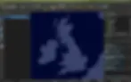
Next, add the layer to your map that you want to “glow!” I’m using UK pub locations from OpenStreetMap because… I don’t have to justify myself. (© OpenStreetMap contributors)
So this is what we’re dealing with… there are so many pubs (what a great problem to have) that it’s difficult to make out any spatial patterns. Let’s firefly this up!
Double click on your layer in the Layers panel to bring up layer settings
In the Symbology tab, change the symbol radius to 0.5, fill colour to white (20% opacity) and remove the stroke, so we have a very faint white dot. You’ll probably want to adapt this depending on the density of your data.
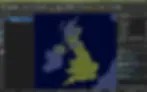
This is the key moment! Right at the bottom of the symbol settings, expand the Layer rendering section. Change the Feature blending mode from normal to addition. If you were to hit ok now, this would look something like…
We’re getting there!
Head back to your layer’s Symbology window.
Click on the Simple Marker’s individual style (rather than the overall Marker group) and scroll right down to the bottom to where you can enable Draw effects. Enable it!
Enable an Outer glow effect. Choose a non-white colour for the glow, and change both the spread and blur radius to 0.75. Switch the blending mode to addition (again, this is super important). This is another stage which you will probably want to come back to and adapt depending on your data density.
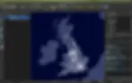
Keep hitting ok til you’re back in your map, and you should have something that looks a little like… 💫

And there you have it! It’s now so much easier to understand the spatial patterns of our data in this way, plus our map looks 🔥🔥🔥
Get confused at all? Here’s me pretending to be Gen Z and explaining the whole process to the tiktoks 👇
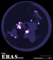
You can take this even further by using different glow colours and radii (not convinced this is a word) to convey different variables. You can also use this effect for lines and polygons - not just points! Here are some more examples to explore: